Complex eshop platform and identity for Visaya
Client
Visaya Solutions
Year
2017-2019
Services
Identity, UX/UX, Video animation
Task overview
I joined Visaya as a sole and first designer at the beginning of 2017. My task from the beginning was to create and maintain a brand identity for the company, mockup wireframes and development ready high-fidelity mockups, and help the team with other materials like social media images, banners, video animations and everything they would need.
In the beginning I had to learn what is automation industry, and what their customers expect. Process automation is very much engineering-focused, somehow old-school industry. Visaya wanted to challenge this, and bring some fresh ideas and concepts to the field. So, my biggest challenge was to balance between a fresh style, but don't go too far; it has to be still familiar for our customers.
Ok, but what is Visaya?
It started as a knowledge-base platform. The original idea was to provide content, articles, reviews and interviews about the automation industry, and recommend products in their webshop. Eventually the focus shifted to the shop direction, and Visaya became primarily an online shop, with some editorial content.
Building the identity
Logo and animation
I started with the logo. I was looking for simplicity, something that has some connection with the flow, the core concept of any process automation solution. In the final version the symbol reminds to the symbol of infinity, and also combines V and A, as VisayA.
We started to build not just writen, but video content as well, so I prepared a simple logo animation that they can use as inserts at the beginning of a video, or divider between sections.
You can see their video channel here, with my animation works.
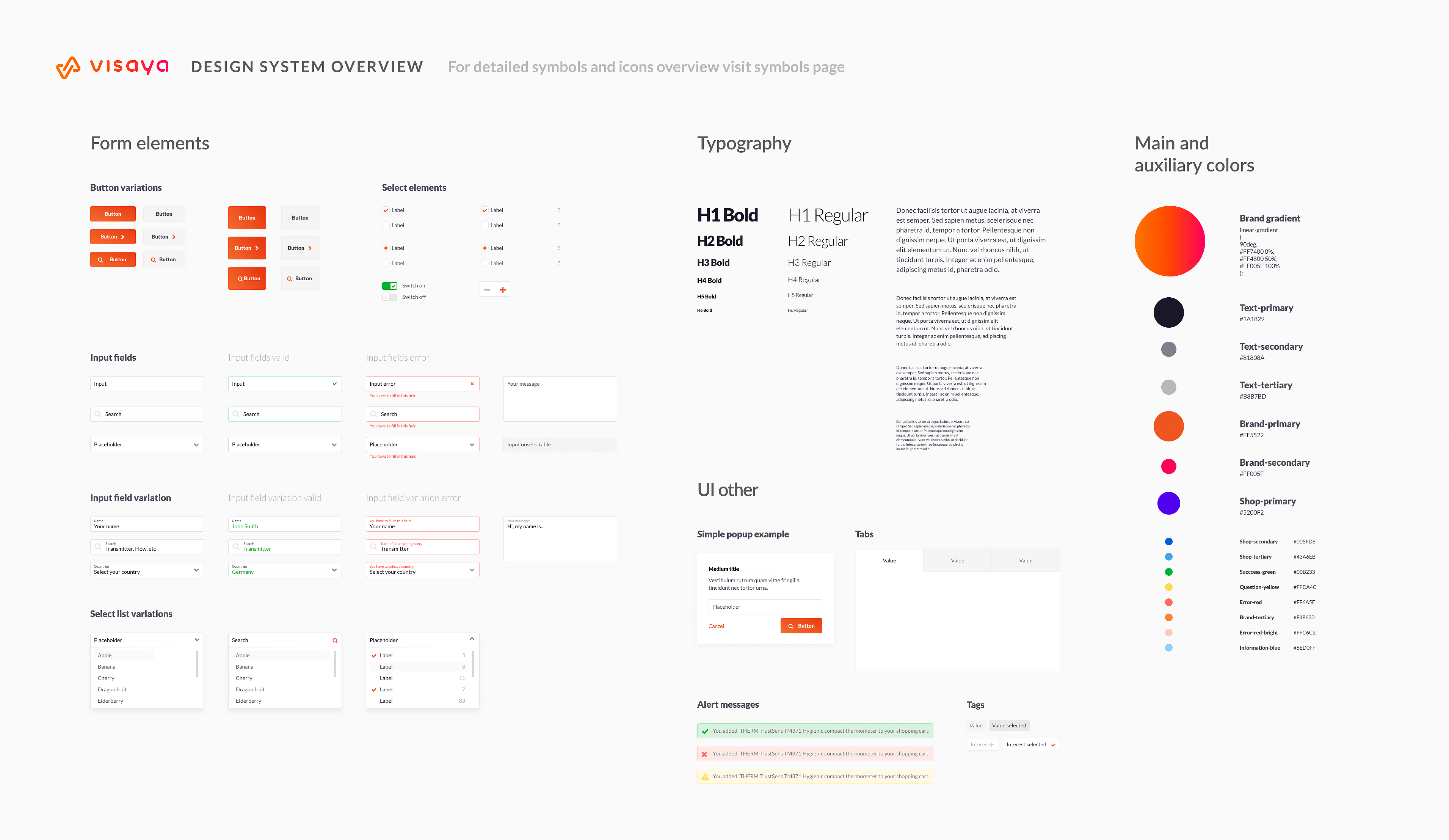
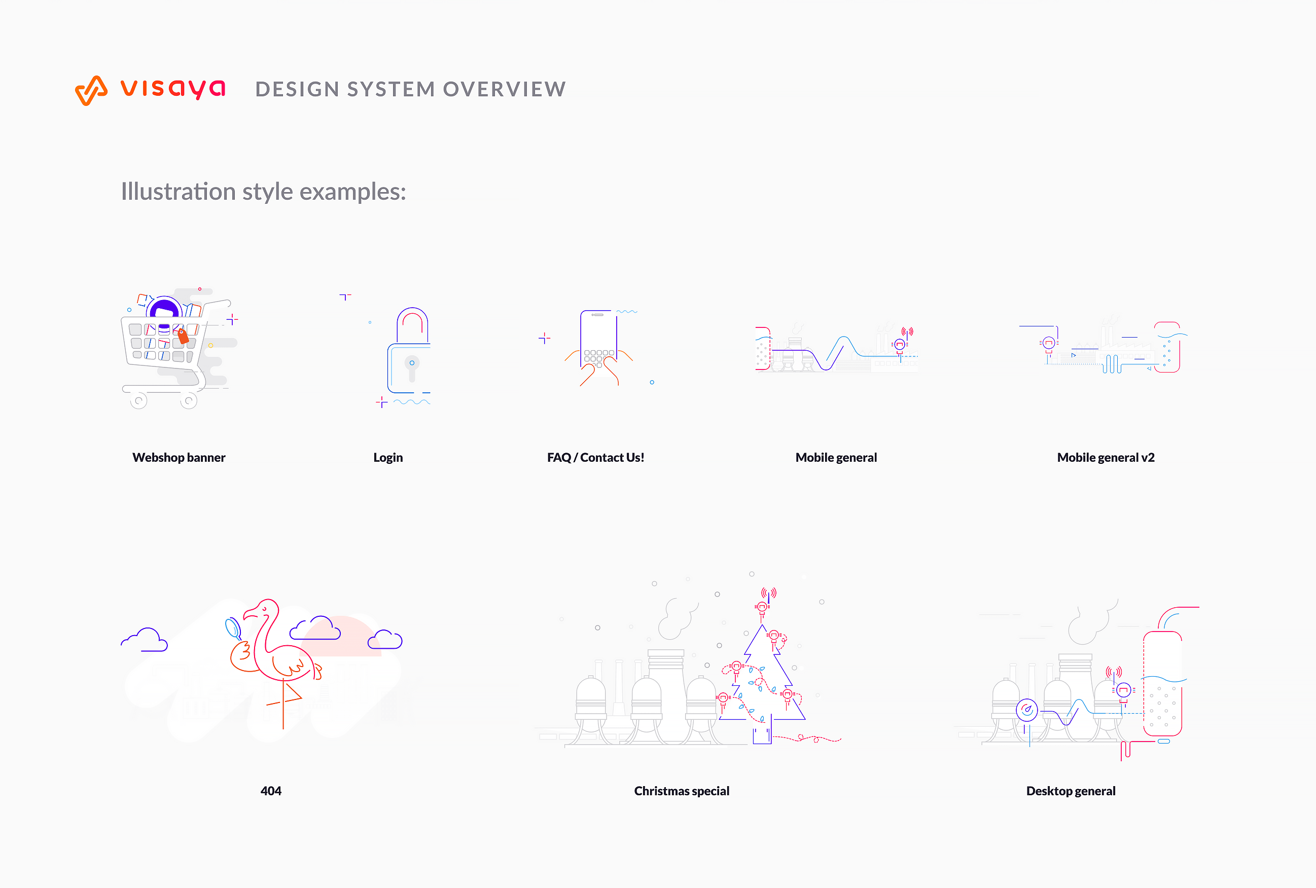
Design system and illustration
Iterations through two year
Of course for such an extensive website I had to build a design system, and find their own illustration style. We didn't use that many illustrations generally, it's a very content heavy site, but still in some cases I had to.
Website
Iterations through two year
Over the two years Visaya went through a couple of iterations, as the scope of the company shifted. I only present here the latest versions, in that stage when I left the company.
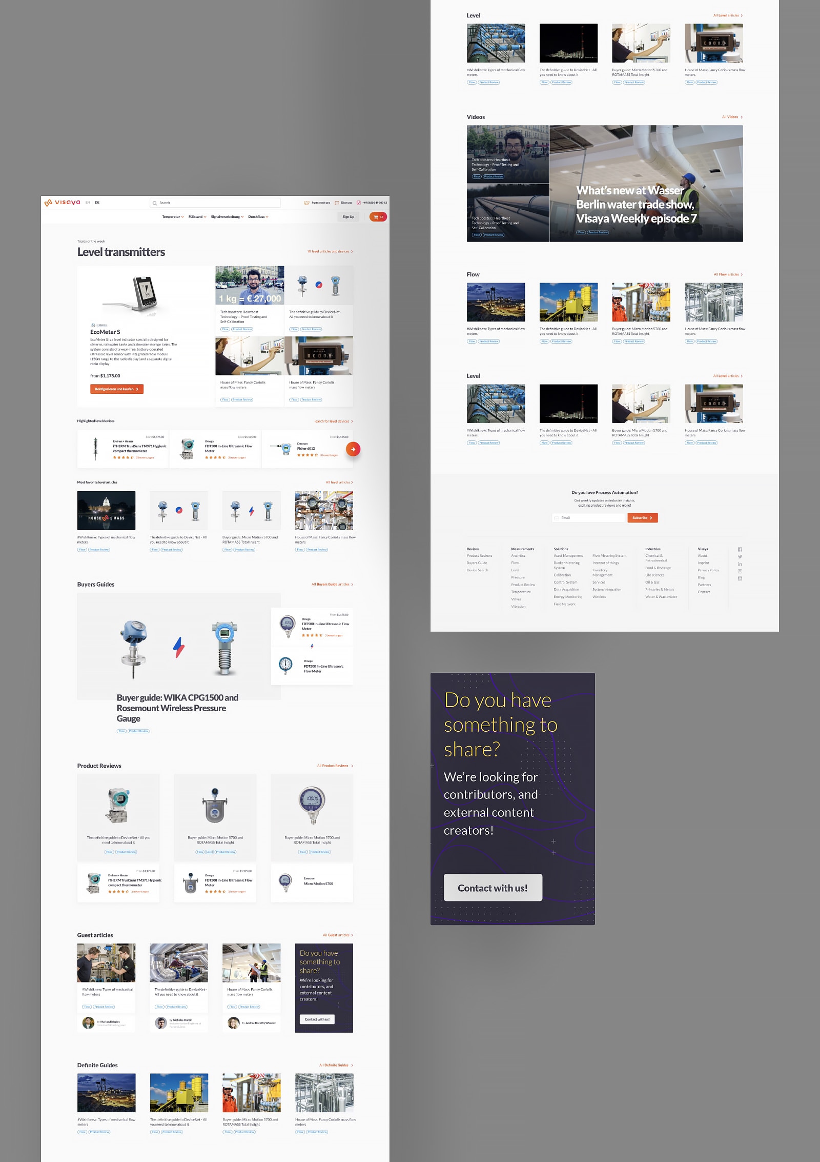
The homepage is a mix of content and device recommendations, comparisons and shop items, focusing on product selling.
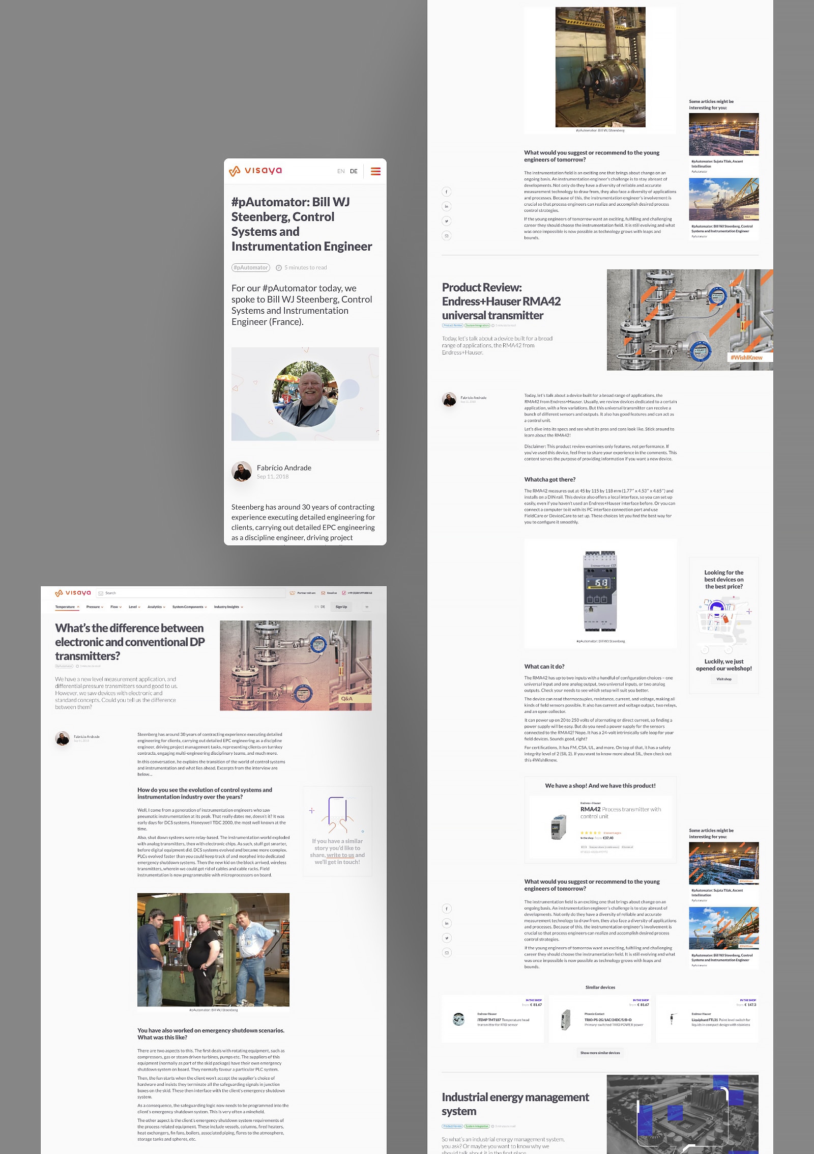
The article pages using ajax endless loading, continuously bringing related articles for the user. Of course it's focusing to conversion, so it has many device recommendations, related product cards and content content recommendations as well.
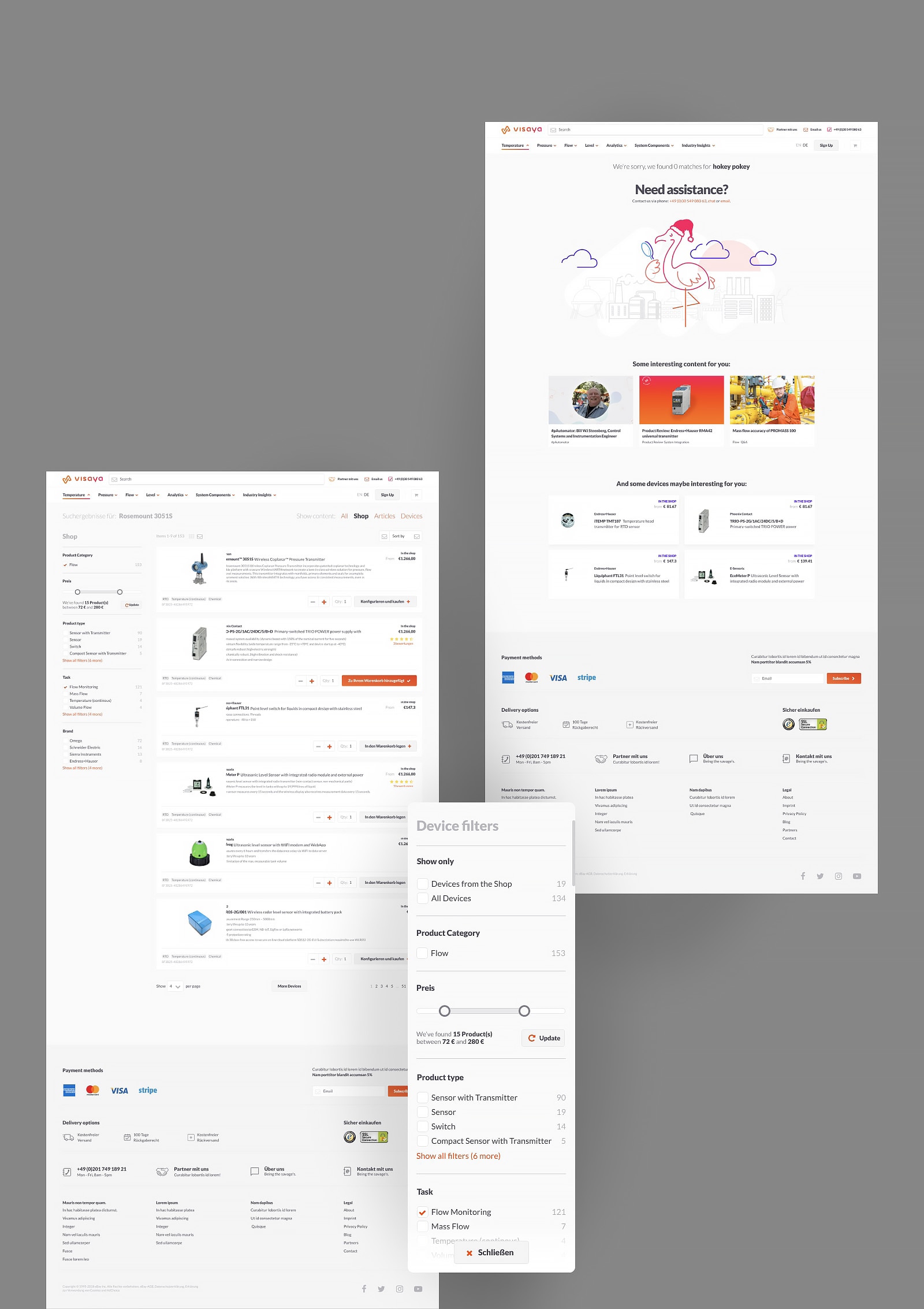
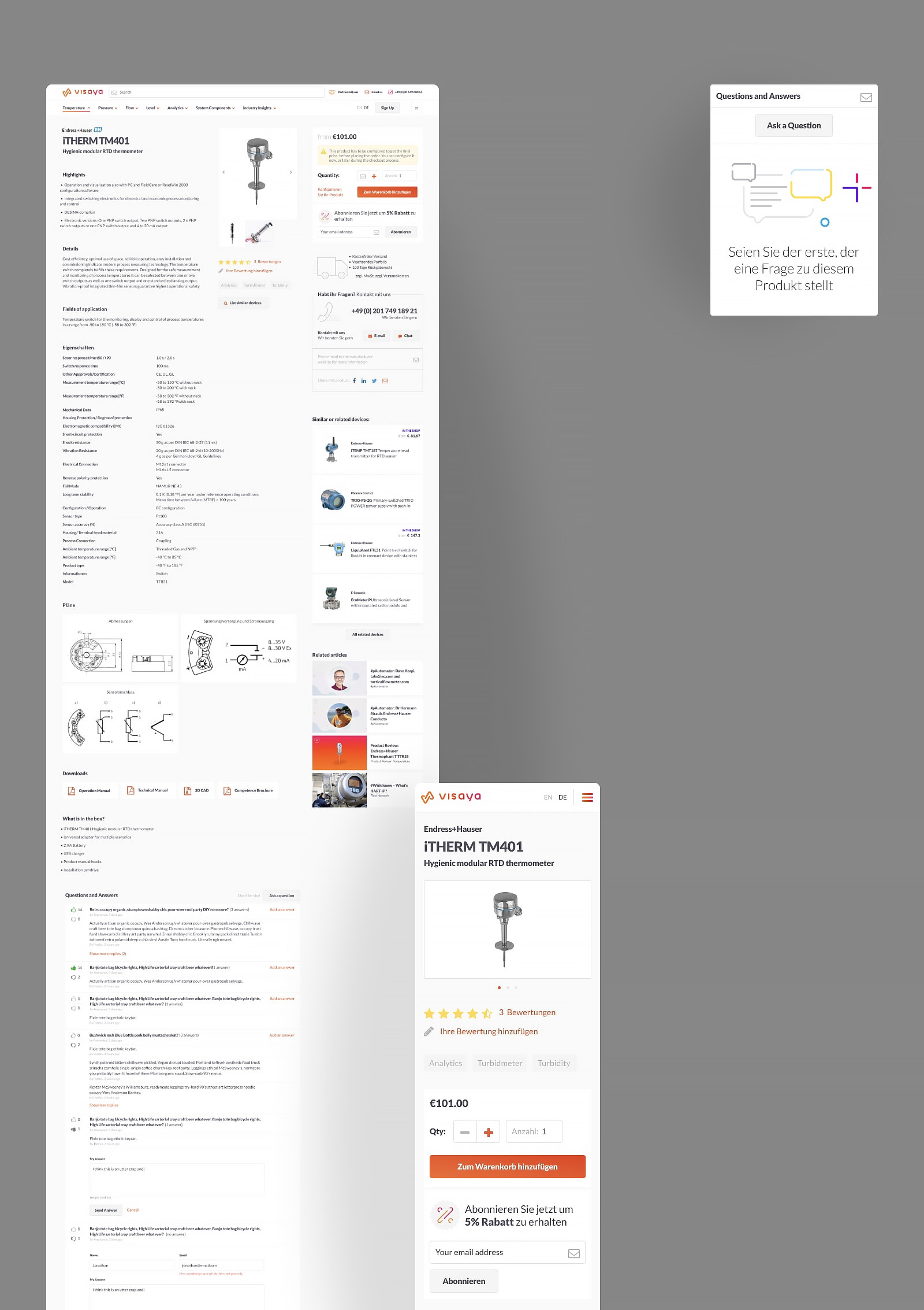
Product page and search
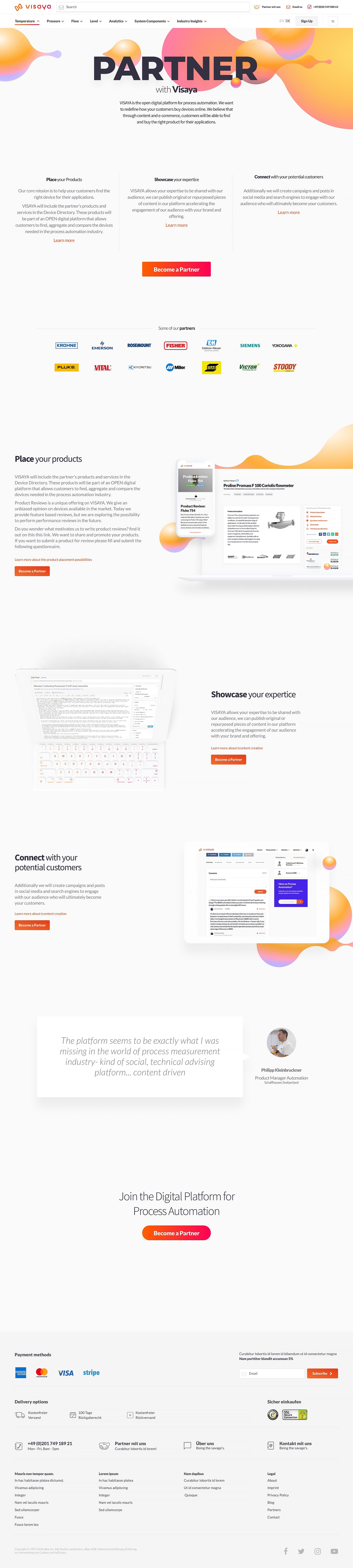
Partners page
I built landing pages for different purposes, one for example for potential partners, explaining in details why should they join to Visaya as external content providers. These pages (as marketing landing pages) needed to look a bit different, but still keep them in Visaya-ish visual design.
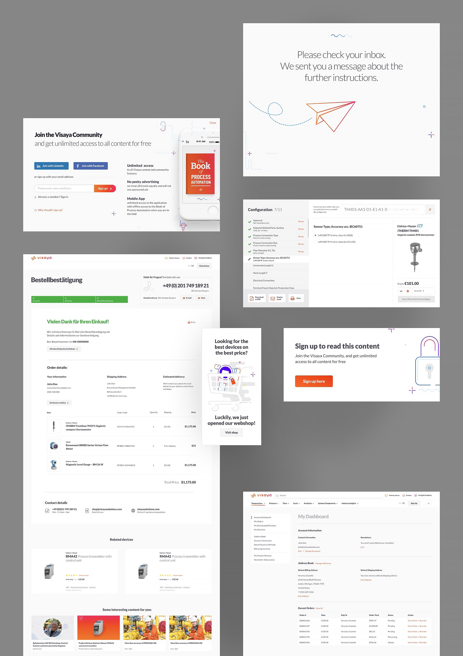
Of course I can't show everything here. I designed checkout processes, a product configurator, user sections and settings, plenty of modals, onboarding screens for mobile and desktop, and a simple iOS app flow and design.
Final thoughts
Hello! I’m super annoyed with designers today, and was trying to remember how many good designers I ever worked with. I could remember 2 people out of my 8+ years of experience of marketing, website redesigns, POing, etc. You are one of those two, so sincere thanks for that. Cheers!
Maria S. former Head of Growth Marketing at Visaya
Two great years
I learned so many things during these years. I helped to build up a huge platform, and shaped its visual design and tone. I conducted research, mentored junior designers, coordinated with internal developers and external teams, did many presentations for different stakeholders, and organize my first Google Design Sprint workshops.
Thank you Visaya!
